|
|
||||||
Using Color to Your Advantage We live in a world of color. You don't have to experience a double rainbow to know what that means. Human beings, perhaps alone in the animal kingdom, have developed an exquisitely fine color sense; most of us are actually able to distinguish between 16 million different hues. While this sense ability has likely developed to provide an evolutionary advantage, might there be other ways to also use color to our advantage in the manmade world? Could a simple choice of color used in our surroundings or in our communications affect a critical outcome? The answer is yes. There is a hidden language of color, and a suite of powerful influences associated with each shade and hue. When you understand how color "works," you'll be able to use it to deliver subliminal messages, influence attitudes and behavior, and create an image that'll help achieve your goals. Now the bad news: you'll have to learn a bit of science first. While you probably retain some vague memories about mixing paint to create new colors in art class, you're far more likely to be choosing tints and creating images on your computer screen than a canvas, and much different "technology" is involved.
If you hang in with me a little while longer through this theory part, you'll be rewarded with a deeper understanding of how colors interrelate and discover how to create really pleasing combinations any time you have color choices to make.
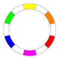
Here's how to construct this segmented wheel: First we start with the 3 basic additive "mixing" colors, in this instance pure red, blue, and yellow, located at the 4, 8, and 12 o'clock positions respectively. These are known as primary mixing colors because they are not created from mixtures of any other colors.
Secondary colors lie midway between the primaries and are a mixture of equal amounts of the nearest primaries. For example, red plus yellow equals orange (this you remember from art class)
The important thing to notice is that the hues are related. For example, if you consider yellow, and view the 3 adjacent colors on either side of it (i.e. 9 o'clock to 3 o'clock), yellow is common to all those 7 colors. Cyan at 9 o'clock has yellow in it, as does deep orange at 3 o'clock. Likewise, the 3 colors on either side of blue all have blue in them and the 3 colors on either side of red have red in them. These colors in common are important in understanding how color harmonies are developed. Another thing to notice is the importance of context when you're viewing colors. The brighter colors on the wheel are more vivid on a black background for example.
Now you see the color wheel extending from an inner circle of the lightest tint to an outer circle of the darkest shade. OK. The hard work is done. We built our color wheel. Now, what can we do with it? What's the practical use? Aside from establishing a practical way of organizing and interpreting color, the wheel will enable you to pick out a group of colors that will look good together. There are four basic color schemes that will guide you.
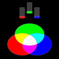
Note: there are actually more possible palettes that can be created from the color wheel. For example a triadic combination uses only the colors which are 120° apart (i.e. one third around the wheel) from each other. As an example, if you chose only the primary colors red, yellow, and blue, and their tints/shades, that would qualify. However, the combination of those three fully saturated colors would probably be only appropriate for children's toys and products. However, sometimes a triadic palette is composed of the secondary colors (purple, orange, and green), and this combo can be quite nice in the right circumstances. I've just presented an easy-to-understand representation of color that's known as a "mixing" color wheel. It's called that because it functions similarly to the way artists mix paints together (e.g. red plus yellow smushed together yields orange). However, starting with red, yellow, and blue isn't the right way to represent how our electronics create color. Computer displays, digital cameras, scanners, projectors, TV screens, and most other electronic devices create color from the "RGB" primaries: red, green, and blue. Think of three equally powerful spotlights, shining their beams down on a white floor in a pitch black room. If we turn on both the red and blue spotlights, their combined light will be magenta. If we just light up blue and green, the combined beam will be cyan. If red and green are lit, the combined beam will be pure yellow. Turn all three on and the combined spot will be white (a prism in reverse). Turn all off and you get... black. The reason you get white from the combination of red, green, and blue is because these lights "add" (that is, each contributes its hue to the total).
Ink, paint, and other similar colored substances don't add. They subtract. The reason a rose appears red is because the flower absorbs all colors except red. It reflects the red wavelength and eyes interpret that as the color red. Ink works the same way. Magenta ink absorbs all colors except magenta, yellow ink absorbs all colors except yellow, etc. An equal mixture of pure magenta and pure yellow absorbs all colors except red. Magenta plus cyan creates blue, and cyan plus yellow creates green. In theory, an equal mixture of pure cyan, magenta, and yellow ink will subtract all color and create black. In reality, the best chemistry still only yields a dark muddy brown so some pure black is added in the mix. This subtractive system is known as "CMYK" for cyan, magenta, yellow, and black. It's the reason you buy those particular colors in the cartridges for your inkjet or color laser printer.
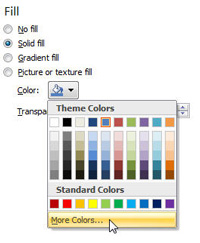
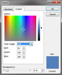
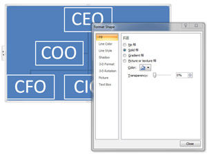
To digress back to science for a moment, if each primary can have one of 256 possible intensities, we can represent 256 x 256 x 256 = 256 cubed = 16,777,216 discrete hues in this "RGB color space." Our corporate color is one of those. Now that we know the specification, here's how to define it in our document. I'm using Microsoft Office 2007 for this explanation, but other applications work in similar ways.
In the format dialog we choose [Fill] and specify (•) Solid fill. Clicking the paint bucket button opens the "Theme Colors" drop-down. At the bottom, click "More Colors" and then the "Custom" tab to reveal the Microsoft square color picker. I think they should have used the color wheel but unfortunately, Bill Gates didn't check with me on this before releasing Office. If you've never seen this deeply buried dialog box before, you might want to waste a few minutes moving the sliders around to see what happens, or you could just enter your RGB values and click OK. That's it... if you want to precisely match your corporate color. However, if you're looking for a sharp accent color, refer back to our color wheel to determine its complement and specify that. This article has been a quick intro and has concentrated on uncovering pleasing combinations of colors. Next month, we'll focus on individual colors and uncover their meaning, symbolism, and suitable applications.
P.S. Please be aware that I've barely scratched the surface of this topic. People get graduate degrees in color science and many thick books filled with equations have been written on the subject. Nonetheless, I hope you've enjoyed this short introductory article. Color Wheel Pro
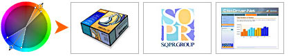
If you want to experience color wheel theory in action, I recommend that you download the free trial version of Color Wheel Pro. Once installed, you'll be able to select a color scheme, manipulate it on an interactive color wheel, and instantly view your chosen color palette displayed on a sample product box, logo, web page, or corporate identity package. |


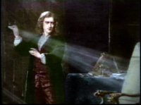 The story starts with Isaac Newton. At Cambridge University in the year 1665, he conducted experiments with light. Allowing a narrow shaft of sunlight to enter his darkened room through a hole in the window shade, Newton observed how a prism placed in the beam would separate the entering white light into a spectrum of colors, a faux rainbow spanning from red to violet (you surely remember ROYGBIV... Red Orange Yellow Green Blue Indigo Violet).
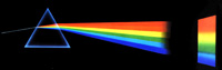
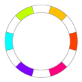
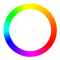 Newton then had the idea to take that linear spectrum and wrap it in a circle, starting and ending with red. Other scientists refined this circle concept over the centuries but in the early 1900's, a Swiss color and art theorist named Johannes Itten developed the modern color wheel, still used today. (He also came up with some interesting human personality type theories based on color and the seasons. More on that in a future issue).
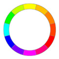 Instead of the infinite spectrum of colors in the ring, it's useful to isolate 12 basic hues like this:
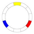
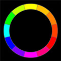 Then six additional tertiary colors are added, being composed of equal amounts of their adjacent colors. This completes 12 hues of the color wheel, now shown on a black background:
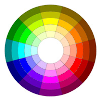 So far, we have a good understanding of pure hues. Pure meaning fully saturated colors that aren't lightened or darkened. When you mix a pure hue with white, you get a lighter tint of that color. Conversely, when you mix in black, you get a darker shade of the color. In reality, there is a continuous gradient between pure white and pure black, but it's helpful to represent it in a limited number of steps; in this case, five intermediate colors centered flanking the fully saturated hue.
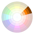 1. Monochromatic
 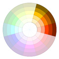 2. Analogous
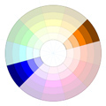 3. Complement
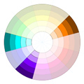 4. Split Complement
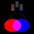
 You may find all this of some academic interest, but are still wondering about the practical application. Here's one example. Let's say you work for a company that has a professionally designed logo and perhaps standardized a "corporate color" (a certain shade of blue). You are working on a proposal and would like to format the section breaks, subheads and bullet points in a compatible color. The first thing you need to specify is the corporate color. There are many ways to specify a specific color (for example a