 PowerPoint Danger PowerPoint Danger
Today, 200 million people will sit in conference rooms, hotel meeting rooms, classrooms, and auditoriums… slowly succumbing to Template Toxicosis and Presenter Paroxysms… caused by excessive exposure to bad PowerPoint. It doesn’t have to be this way. PowerPoint is not evil. Used properly, it can help you be a more effective communicator, persuade an important audience that your ideas are sound, and convince them to give you what you need to achieve your goals. Unfortunately, that’s rarely how things turn out in the real world. Far more often than not, PowerPoint becomes a speaker’s crutch, leading to deadly dull presentations that fail to benefit anyone.
After 30+ years working in the corporate and non-corporate world, I’ve delivered upwards of 1,000 PowerPoint presentations and sat through several times as many delivered by others. (The first version I used was PowerPoint 97 and before that we made 35mm slides, projecting them with a Kodak Carousel projector, Don Draper style). But practice doesn’t always make perfect. I’ve probably made every bad mistake you could imagine. I somewhat console myself with the knowledge that the vast majority of other people’s presentations I’ve attended also fell into the evil category. As much as I’d like to have some of those 10,000 wasted hours back in my life, I’ve resolved to move forward and do what I can to ensure that my PowerPoints help mankind... or at least not further contribute to the decline of civilization...
I’m presenting the following ten points as “rules,” but I hope you know that rules are sometimes meant to be broken… as long as you *know* you’re breaking them… and have a good reason to do so. Also, as usual, my perspective comes from a business-to-business marketing orientation. If you’re in academia, the rules might be different, particularly with regard to “information density” (more on that later). Nonetheless, if you’re a fund-raiser, politician, medical professional, or in any position where you must communicate powerfully and succinctly, then I’m talking to you.
 Rule #1: Use More Graphics, Fewer Words Rule #1: Use More Graphics, Fewer Words
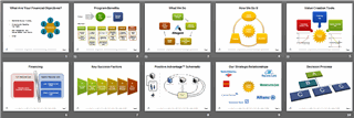
Software applications like PowerPoint and Apple Keynote make it easy for anybody to create presentations using templates which encourage you to just “pour in the words.” The end result is a series of dull, text-laden slides. The programs also promote use of bullet point lists. While bullets are somewhat better than a huge block of paragraph text, it’s still a bad situation. If your slides are wordy, people will try to read and listen at the same time, which means they won’t succeed at either task.
In general, the fewer words the better. Therefore, your images need to carry the load. The right photo or symbolic image will bring power to your talk, and make it memorable. But please avoid clip art clichés. I still see presentations with that cartoonish detective character holding a giant magnifying glass, five people around a conference table, a ringing alarm clock, two hands shaking, etc., etc., etc. Ugh. Worse yet is a random collection of different art styles, all scraped off the web, and thrown together in the same slide deck. Your presentation deserves better. Cheap cheesy clip art devalues you and your message. There are *literally* millions of photos on iStockPhoto.com (367,204 with the keyword “business” alone). Another great source is Flicker.com. Search for images available under the “Creative Commons” license.
However, what happens when you can’t find the right image? Or if you can’t symbolize your concept with the “SmartArt” feature in PowerPoint? Then make a word picture. A few well-chosen words are better than an ill-chosen graphic.
 Rule #2: Strive for Simplicity Rule #2: Strive for Simplicity
If there’s one theme to successful presentations, it’s this: LESS is MORE. Nowhere else is brevity and simplicity more appreciated. Use fewer slides, not more. Have fewer words on each, use less embellishment, fewer special effects, plainer fonts, simpler diagrams, etc. One thing you can’t skimp on is quality, especially when it comes to graphics and images. Low-res photos and pixelated drawings look bad. People might not say anything, but they definitely notice. Another mark of a pro is good alignment. Bits and pieces aren’t placed randomly. They share a common baseline, observe uniform page margins, have symmetry, etc. Again, people notice this more than you’d imagine, and when things are “off,” it distracts them.
Rule #3: Keep it Short
Most presentations go on way too long. That’s because they’re often thought of as “information transfer” sessions. People think “Gee, I’ve got a lot of important information to deliver.” Hey, you might. But we live in the era of Short Attention Span Theater. Audiences get fidgety pretty fast these days. Their ability to retain lots of info also isn’t what it used to be. Better to think of your presentation as a motivational session. Keep it short and impactful. If you’ve done a good job “selling” your info, your audience will be motivated to read more on their own (the way most real learning occurs). It’s hard for me to imagine a situation where a presentation should go on for more than an hour.
Rule #4: Tell a Story
Above all, your presentation IS theater. A show. And every show needs a beginning, middle, and ending -- translating roughly to “orientation” “presentation” and “call to action.” Start by telling/showing people why they should pay attention and/or state the problem and/or state the goal. Then fill in the middle, and finish by asking for a decision or agreement on what comes next. The beginning and ending are critical. They’re what people will remember best. Therefore: start strong, end strong, and try not to bore people in the middle!
Three Very Different Kinds of Presentations
There are three main “venues” for PowerPoint usage: (1) the traditional conference room or auditorium where slides are projected on a screen or displayed on a large flat panel, (2) “across the desk” where slides are typically printed on paper and presented upside-down or handed out to one or more people without projecting them, and (3) as a stand-alone distributed document, read on screen or on paper without you being present. What’s appropriate for one will rarely work well for the others. For stand-up presentations, you can be much more “theatrical” and show nothing more than photos and idea graphics. For a printed-out briefing, you need content you can talk over, yet have detailed substance of its own. And for a “deck” that’s sent out for private reading, there must be sufficient content to tell the whole story by itself. |
Rule #5: Be Consistent
Nothing makes a presentation look more amateurish than a jumble of different fonts, colors, styles, backgrounds, etc. A professional presentation is consistent slide-to-slide. However, it’s easy to mess this up. A bad offender is varying text size. Pick a font size (a big one) and make that the standard for everything. If you can’t fit it all on one slide, break it across two, or better yet, use fewer words (a lot fewer...). If you use images or clip art, ensure they all have a consistent “family” look. However, full-screen photographs can break this rule (and often should, as they’re often meant to be disruptive). As you’re building your presentation, use the “Slide Sorter” view from time to time to get a high altitude look.
 Rule #6: Blank the Screen Rule #6: Blank the Screen
There is rarely a reason to leave a slide up on the screen for more than 30 seconds. Either move to the next slide or better yet, blank the screen. You can do this in three ways: (1) press the “B” key if the keyboard is close at hand (remember “B” for blank), (2) block the projector lens with a piece of cardboard or a book, or (3) use a remote control that has a dedicated button for screen blanking, like the Kensington Wireless Presenter
I favor option #3. You will do your audience and yourself a big favor by blacking out the screen from time to time. It breaks the hypnotic effect of the glowing screen and immediately redirects all attention where it belongs: on you.
Rule #7: Don’t Read for Your Audience
Please, please, please... do not read the text on your slides verbatim to your audience. (A.K.A. “PowerPoint Karaoke.”) They’re adults. They can read. You’re insulting their intelligence. Just make very sure that every word and number is legible – from the very last row! If you find yourself saying things like: “You probably can’t read this but...” please know that you’re infuriating your audience. Make it bigger or get rid of it. There’s also no point in projecting a huge table of tiny numbers, unless you enjoy pissing people off.
Webcasts and Webinars
An increasing number of live presentations are now being delivered over the web, via WebEx, GoToMeeting, and the like. These webcasts have a lot in common with traditional stand up presentations but are even more challenging to deliver since you can’t see the audience or “read the room.” Unfortunately, with little feedback or interactivity, presenters often power through and just bulldoze the audience. |

Rule #8: It’s About You, Not your Slides
Let’s be clear about this: a presentation is not (just) a transfer of information. It’s a transfer of emotion (usually enthusiasm, but sometimes anger, repentance, or other sentiments). If all you have to transmit are some “agenda-less” facts and figures, do everybody a big favor and just send a memo.
Rule #9: No Slidejunk
Anything that distracts your audience should be banished. Decorative fonts, too-big every-page logos, ornate backgrounds, sound effects, gimmicky transitions – they’re all slidejunk. Kill them. If you’re tempted to include animation for amusement or to “spice up” your presentation, please do not give in to that temptation. Animation should only be deployed when there is a strategic need for it. And that need is rare. Having objects flying on the screen is just plain annoying to your viewers. However, if you have something undesirable to say and wish it be ignored by your audience, then by all means, as you speak the words, have something appear out of nowhere and fly on to your screen. You won’t be heard...
 Rule #10: Practice, Practice, Practice! Rule #10: Practice, Practice, Practice!
PowerPoint slides are not your cue cards. If you need to turn and read the text on the screen in order to prompt you what to say, it means you have not practiced your presentation enough. Practice means actually standing up and speaking out loud. There is no shortcut for this. Reading it through silently will not do the job. Insufficient prep is the number one reason people fail at giving presentations. If it’s important enough for you to be presenting, it’s important enough for you to dedicate the time to prepare. Figure on about two hours practice for a short talk on a subject you know well, up to about 20 hours for a longer talk on material you’re not already expert in.
In her book “Resonate: Present Visual Stories That Transform Audiences” Nancy Duarte references a survey which found 86% of executives believe that communicating with clarity directly impacts their career and income. Yet only one in four spends more than two hours practicing for a high stakes presentation.
When you really know your material, you can shift your focus from “keeping up with your slides” to connecting with your audience. There’s no substitute for that human connection, which includes lots of eye contact (essential for holding their attention).
Having solid command of your topic also enables you to cut way down on the number of words on your slides. That means less distraction for your audience, and more focus on you, as you amplify and expand upon the (sometimes abstract) ideas in your presentation.
People love to rant about how bad PowerPoint is. Dozens of articles have been published about the failings of this program. Of course, it’s the person holding the remote, not the program that’s the problem. PowerPoint is just a tool. When you use it with dexterity and skill, you will absolutely help your audience understand complex issues and drive them to positive action.

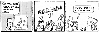
PowerPoint Comedy
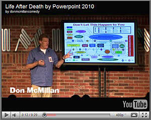
Click to Play (9:29)
Don McMillan is a stand-up comedian who performs wearing a laminated employee ID badge. His riff on PowerPoint is a modern day classic. Click through if you haven't seen it yet.
Return to Archive |
