|
|
What's Your Type? I'm not talking about your personality type (that's a topic for a future Urbach Letter). I'm talking about type as in typewriter. Type as in font. Type as in typesetting. Not just the digital equivalent of "hot lead," but the art and science of formatting pages (web or paper) to dramatically enhance all your written communications. Clueless or criminal?
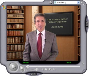
A word of caution: Click here to begin: (Please click once and wait for the video to start streaming on your computer) You didn't click? Grrr. <Victor makes angry face at you> Why not?!!? Are you so sure that insipid make-work project you've been fussing over all morning is more important than what I have to show you now? Fun With Fonts
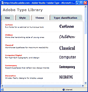
Time for a little fun. Here's a link for the Adobe Type Library. Click it and you'll see a page that looks like this:
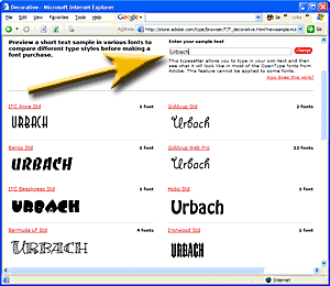
Next, click on one of the type themes. (I chose "Decorative"), and enter your last name or company name in the box in the upper right hand corner. The gold arrow is pointing to it in the screen shot below:
Now the fun begins. From this point forward, the Type Library will render your name in every type style you click on. I've got to warn you though, you can waste some serious time on this activity; it's very engrossing. So, I recommend you go at it with some business purpose in mind. The decorative fonts are really fun, but consider selecting a "signature font" for yourself. I did just that 15 years ago when I started The Optran Group. I chose "Gill Sans" as the Optran corporate typestyle, and have been using it as the default word processor font ever since. If you find a typestyle you like, and think you'll be using it in print, you may want to consider buying it from Adobe or another type foundry. Of course, there are tons of free fonts available for download all over the net (start here, or do a Google search), and they're fine for casual use. However, there *is* a quality difference in the commercial products you'll notice (once you know what to look for). By the way, if you enjoyed this little diversion, I know you'll really enjoy April's video. Fine typography is art.
|

